Retail News CRM

Tag: Embrace

  • Embrace the Digital Detox: Join KitKat’s Rawdog Your Commute Challenge for a Chance to Win a Weekend Escape

    Embrace the Digital Detox: Join KitKat’s Rawdog Your Commute Challenge for a Chance to Win a Weekend Escape

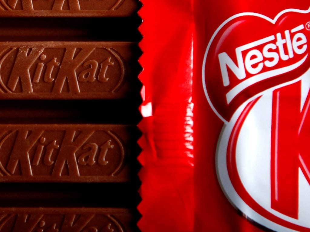
    KitKat, the renowned confectionery brand, is inviting Australians to embrace the growing trend of going entirely phone-free during their daily commute. This trend, aptly named ‘rawdogging’, has rapidly permeated everyday culture, with evidence of its popularity evident in the over 45 million posts on the social media platform, TikTok.

    KitKat ‘Rawdog your Commute’ Challenge

    In a bid to encourage individuals to take a break from their phones, KitKat has introduced the ‘Rawdog your Commute’ Challenge. This initiative involves a game that challenges commuters to see the length of time they can go without using their phones. Participants stand a chance to win one of 10 Unyoked 2-night weekend getaway e-gift cards, valued up to $626, which can be used anywhere in Australia. The longer the phone-free period, the higher the probability of winning.

    To participate in the game, individuals can scan a QR code on billboards positioned near commuting locations. Alternatively, they can visit the campaign’s website to start a timer that tracks the duration they can abstain from using their phone.

    Australians Crave a Break from Their Phones

    The launch of this campaign is timely as recent research commissioned by KitKat reveals that a significant 84% of Australians desire a break from their mobile devices. Additionally, 23% of respondents expressed that being phone-free would make their commute more enjoyable. Among those who have inadvertently been without their phones, 40% reported feeling happier, liberated, relieved, and more present.

    Shannon Wright, Nestlé Oceania’s Head of Marketing for Confectionery, commented on the campaign, stating, “KitKat has always been about aiding Australians in taking better breaks. However, disconnecting has become increasingly challenging in today’s digital age. This is why we’re encouraging commuters to rawdog their commutes via our new Phone Break game. We aim to make it achievable by rewarding those small, everyday moments that are transformed into a proper break.”

    KitKat asserts that this campaign is a contemporary take on its longstanding efforts to promote healthier breaks. It taps into the burgeoning consumer interest in digital well-being.

    Questions & Answers

    What is the aim of the KitKat ‘Rawdog your Commute’ Challenge?
    The challenge aims to encourage commuters to take a break from their phones during their daily journeys, making their commute more enjoyable and relaxing.

    How can one participate in the ‘Rawdog your Commute’ Challenge?
    Participants can join the challenge by scanning a QR code on billboards near commuting locations or by visiting the campaign’s website.

    What are the rewards for the challenge?
    Participants stand a chance to win one of 10 Unyoked 2-night weekend getaway e-gift cards, valued up to $626, to be used anywhere in Australia. The longer one goes without using their phone, the higher the probability of winning.
  • Embrace the Modern: Google Maps Unveils Fresh Icon Design on Android and iOS

    Embrace the Modern: Google Maps Unveils Fresh Icon Design on Android and iOS

    Google Maps, one of Google’s most popular apps and a fixture on the first-generation iPhone, has undergone another update. In its pursuit of continual improvement, Google has added new features and refined the app’s user interface over the years. Now, the tech giant has updated the Maps app icon for both Android and iOS versions.

    A Modern Look for Google Maps

    The new icon continues to feature the recognizable “pin” symbol, but its design has been significantly modified. The most prominent change is the color gradient that seamlessly transitions from one shade to another. This is a departure from the previous icon, which showed a diagonally placed “pin” with separate, differently colored boxes (blue, green, yellow, and red). The revamped “pin” is also larger, with the circle within it having increased in size. Consequently, the top ring of the pin has become much thinner.

    If you recall the Google Maps icon on the first iPhone, it depicted two intersecting lines, representing roads, with a red pin and a sign for Highway 280. Subsequently, the icon evolved into a folded map featuring blue, green, yellow, and white blocks, with a red pin to the right and a lowercase “g” in the upper left corner. The Android version of the app icon was similar but replaced the “g” with a capital letter.

    New Icon for Google Maps on iOS or Android

    The new icon should be visible in version 26.09.06.873668274 of Google Maps for Android users and version 26.09.5 for iOS users. If you are yet to see the new design, you may need to update your Google Maps app.

    For Android users, this can be done by opening Google Play Store, tapping on the profile icon in the right corner, selecting “Manage apps & device”, and viewing “details”. You can then scroll down to find Google Maps, and if an update is available, tap on “Update”.

    For iOS users, the process involves opening the App Store, tapping on the profile icon in the right corner, selecting “Updates”, and scrolling down to find Google Maps. If there is an update available, tap on the “Update” button.

    After the update, the new Google Maps icon should be visible on your phone, signifying a more modern-looking Google Maps.

    A Brief History of Google Maps

    For many, Google Maps has been an essential tool since its inception. I first used the app in 2007 on my iPhone. In 2009, I experienced Google Maps with turn-by-turn directions on the Motorola Droid, the first phone equipped with Android 2.0. It felt revolutionary at the time and was one of the key selling points for the Droid and other Android phones. It wasn’t until December 2012 that this feature was finally added to the iPhone.

    Questions & Answers

    What is the most notable change in the new Google Maps icon?
    The new icon features a color gradient, transitioning smoothly from one shade to another. This replaces the previous design of separate, differently colored boxes. The “pin” is also larger, with an enlarged circle inside it, making the top ring of the pin thinner.

    How can I update the Google Maps app to see the new icon?
    For both Android and iOS users, you may need to update the app through Google Play or the App Store. If an update is available, select “Update” and the new icon should appear once the update is complete.

    When was turn-by-turn navigation first introduced in Google Maps?
    Turn-by-turn navigation was first introduced on the Motorola Droid in 2009, which operated on Android 2.0. This feature was later added to the iPhone version of the app in December 2012.