Retail News CRM

Tag: Icon

  • Embrace the Modern: Google Maps Unveils Fresh Icon Design on Android and iOS

    Embrace the Modern: Google Maps Unveils Fresh Icon Design on Android and iOS

    Google Maps, one of Google’s most popular apps and a fixture on the first-generation iPhone, has undergone another update. In its pursuit of continual improvement, Google has added new features and refined the app’s user interface over the years. Now, the tech giant has updated the Maps app icon for both Android and iOS versions.

    A Modern Look for Google Maps

    The new icon continues to feature the recognizable “pin” symbol, but its design has been significantly modified. The most prominent change is the color gradient that seamlessly transitions from one shade to another. This is a departure from the previous icon, which showed a diagonally placed “pin” with separate, differently colored boxes (blue, green, yellow, and red). The revamped “pin” is also larger, with the circle within it having increased in size. Consequently, the top ring of the pin has become much thinner.

    If you recall the Google Maps icon on the first iPhone, it depicted two intersecting lines, representing roads, with a red pin and a sign for Highway 280. Subsequently, the icon evolved into a folded map featuring blue, green, yellow, and white blocks, with a red pin to the right and a lowercase “g” in the upper left corner. The Android version of the app icon was similar but replaced the “g” with a capital letter.

    New Icon for Google Maps on iOS or Android

    The new icon should be visible in version 26.09.06.873668274 of Google Maps for Android users and version 26.09.5 for iOS users. If you are yet to see the new design, you may need to update your Google Maps app.

    For Android users, this can be done by opening Google Play Store, tapping on the profile icon in the right corner, selecting “Manage apps & device”, and viewing “details”. You can then scroll down to find Google Maps, and if an update is available, tap on “Update”.

    For iOS users, the process involves opening the App Store, tapping on the profile icon in the right corner, selecting “Updates”, and scrolling down to find Google Maps. If there is an update available, tap on the “Update” button.

    After the update, the new Google Maps icon should be visible on your phone, signifying a more modern-looking Google Maps.

    A Brief History of Google Maps

    For many, Google Maps has been an essential tool since its inception. I first used the app in 2007 on my iPhone. In 2009, I experienced Google Maps with turn-by-turn directions on the Motorola Droid, the first phone equipped with Android 2.0. It felt revolutionary at the time and was one of the key selling points for the Droid and other Android phones. It wasn’t until December 2012 that this feature was finally added to the iPhone.

    Questions & Answers

    What is the most notable change in the new Google Maps icon?
    The new icon features a color gradient, transitioning smoothly from one shade to another. This replaces the previous design of separate, differently colored boxes. The “pin” is also larger, with an enlarged circle inside it, making the top ring of the pin thinner.

    How can I update the Google Maps app to see the new icon?
    For both Android and iOS users, you may need to update the app through Google Play or the App Store. If an update is available, select “Update” and the new icon should appear once the update is complete.

    When was turn-by-turn navigation first introduced in Google Maps?
    Turn-by-turn navigation was first introduced on the Motorola Droid in 2009, which operated on Android 2.0. This feature was later added to the iPhone version of the app in December 2012.

  • “Swedish Icon Craft Sportswear Debuts Flagship Store in Shanghai, Amping Up Expansion in Asia”

    “Swedish Icon Craft Sportswear Debuts Flagship Store in Shanghai, Amping Up Expansion in Asia”

    Sweden’s Craft Sportswear, a high-performance athletic apparel brand, has recently launched its premier flagship store in China.

    Athletic Excellence: Craft Sportswear

    A standout in the sportswear industry since its inception in 1973, Craft Sportswear has built its reputation on providing top-tier athletic apparel designed for running, cycling, and cross-country skiing. This powerhouse brand, widely recognized throughout Europe, has been progressively branching out into Asia since 2021. The opening of their first flagship store in China marks a significant step in their expansion efforts.

    Exciting Milestones: Store Opening in Shanghai

    The new Craft Sportswear store, located at Taikoo Hui in Shanghai, has been hailed as an “exciting milestone.” Craft Sportswear also recently revealed that it will be the official teamwear partner for Norway’s Winter Olympic and Paralympic teams, further establishing its credibility in the sports industry.

    A representative from Craft Sportswear expressed the brand’s enthusiasm for this global retail development, stating, “This milestone marks an exciting step in our global retail expansion – bringing our Swedish performance heritage to Shanghai with a space designed for world champions and everyday heroes.”

    Health and Wellness: Aligning with China’s Priorities

    This significant expansion is in line with China’s growing emphasis on health, wellness, and lifestyle choices, as reflected in their current five-year plan. In this plan, sports, outdoor activities, and quality living are actively encouraged. Craft’s move to establish a presence in China, therefore, aligns perfectly with these objectives, reflecting the brand’s commitment to promoting an active and healthy lifestyle.

    Questions & Answers

    What is the focus of Craft Sportswear’s product line?
    Craft Sportswear specializes in high-performance athletic apparel designed for running, cycling, and cross-country skiing.

    What recent milestone has Craft Sportswear achieved in its global expansion?
    Craft Sportswear has recently opened its first flagship store in China, marking a significant step in its global expansion efforts.

    What recent partnership has Craft Sportswear announced?
    Craft Sportswear has announced that it will be the official teamwear partner for Norway’s Winter Olympic and Paralympic teams.

  • Google is making changes to the Chrome icon for the first time since 2014

    Google is making changes to the Chrome icon for the first time since 2014

    A tweet from Google Chrome designer Elvin Hu reveals that for the first time in eight years, Google is changing Chrome’s icon. The new look debuted with the update to the Chrome Canary app which is an experimental and unstable version of the browser used by developers and early adopters. Other versions of Chrome that Android users can install are the stable, beta, and Dev versions.

    And not that it has anything to do with the new icon, you still might want to know the difference between each one. As we noted, Chrome Canary offers an untested build of Chrome which might not run at times. Google recommends that only developers and advanced users install it on their handsets since most Canary updates won’t proceed any further.

    Installing the Chrome Dev version of the browser allows you to test out the latest features of the Chrome browser even though, as Google says, they will be “rough around the edges.” Google is hoping that Android users will provide them with early feedback when testing out new features that may never make it to the Beta or stable versions of the app.

    And there is also the Chrome Beta app which is the last step for a new feature before it is added to the stable version. It is not as unstable as the Dev version and features receive their final tweaks on the Chrome Beta app before millions of people use them on the stable version of Chrome.

    Lastly, the stable Chrome app is the safest version of the browser and is the one that you’ll see in the Play Store if you search for Google Chrome. Most of you shouldn’t install Canary or Dev while some of you might have an interest in downloading the Beta version of Chrome on your phone.

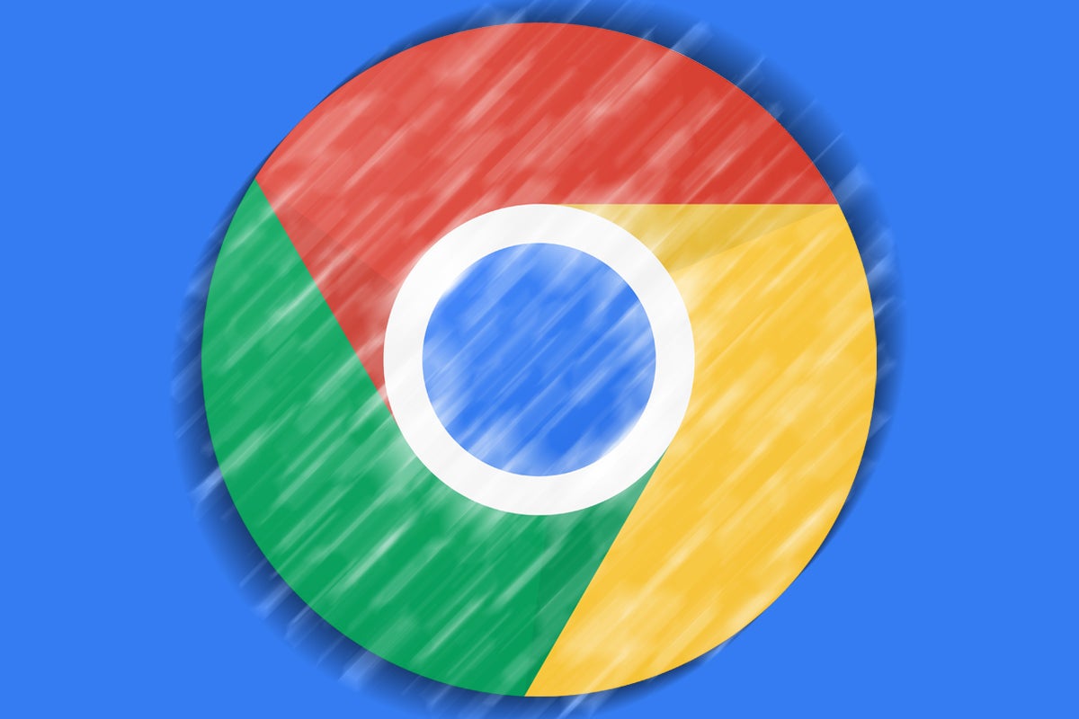
    As for the main branding of the Chrome logo, the shadows between the colors (which are easily seen between the red and yellow colors) are being removed. This removes the slight 3D effect that made it appear as though the red area was raised above the yellow. Removing that small shadowy area makes the colors on the newly updated main icon appear flat.

    Chrome’s Hu also noted that “We simplified the main brand icon by removing the shadows, refining the proportions and brightening the colors, to align with Google’s more modern brand expression.” Google found that placing certain shades of Green and Red next to each other created what Hu called “an unpleasant color vibration.” To combat this, Google used a more subtle gradient (so subtle that you might not notice it) in order to prevent the unpleasant vibration from bothering the viewer.

    Interestingly, Google created different variants of the Chrome icon for each operating system. As Elvin said, “We want the icons to feel recognizably Chrome, but also well crafted for each OS. For example, on Windows, the icons take on an obviously gradated look, appearing at home on Windows 10 & 11.”

    On ChromeOS, brighter colors will be used without gradients so that the icon can match the rest of the system icons. On MacOS, a small shadow will soon be employed to give the icon a 3D appearance. On iOS, the Chrome Beta will  show the logo in a blueprint-style background to show that it is a developer-focused app.

    The new Chrome icons are expected to hit your devices soon. Google has been shrinking the size of the Chrome icon going back to 2008 when it had the appearance of a 3D ball. There really is a lot of thought that comes into play even when trying to design a simple app icon.

  • Google accidentally reveals new icon and name for a key Android app

    Google accidentally reveals new icon and name for a key Android app

    Over the last few weeks, Google has been making changes to the icons for its apps like Gmail, Calendar, Drive, Docs, Sheets, Slides, Meet, and more. Google added more of the company’s traditional colors (blue, red, yellow, and green) to the icons belonging to its apps. Now, an eagle-eyed Reddit user (vihas spotted what seemingly will be the new icon and name of the app currently known as Phone by Google. The leaked icon and name were spotted in an ad found on YouTube.

    Based on the ad, the new name of the app will be Google Call and the icon resembles the illustration of a on the new Google Voice icon. One major difference is that the illustration of the landline ear and mouthpiece is done up in Google’s four colors. Note that the new name and icon are not yet in use in the Google Play Store and when the change will be made is anybody’s guess. The current icon shows a landline hand and mouthpiece in white against a blue background.

    The ad that leaked the new name and logo for what is now Phone by Google highlights the app’s “reliable” caller ID that Google says  “lets you answer with confidence.” Google has been adding new features to the mundane app including Hold for Me. This feature comes into play when you’re placed on hold after dialing a toll-free number. you will see a prompt that reads “Don’t hang up” prompt with the option to “Return to call” always available. When a real live person starts talking, the phone will ring and vibrate alerting you that the call is no longer on hold. A transcription at the bottom of the screen keep tabs on what is being said while you are on hold. As Google states, the Google Duplex technology used to drive Hold for Me “not only recognizes hold music but also understands the difference between a recorded message (like ‘Hello, thank you for waiting’) and a representative on the line.”

    Hold for Me is the typical new Android feature that Google adds to its mobile OS to make to help with the little things in life that can be a big pain in the butt. We probably all agree that waiting on hold is generally as much fun as hammering a nail through your skull.

  • Lagerfeld’s legacy: double-digit growth and €10 billion

    Lagerfeld’s legacy: double-digit growth and €10 billion

    Fashion icon Karl Lagerfeld delivered French maison Chanel a stunning legacy in the final year of his life. Chanel, privately owned, has revealed financial information only twice in its 109-year history. But yesterday, finance chief Philippe Blondiaux took the extraordinary step of announcing the brand had achieved global sales of almost €10 billion last year, in an apparent tribute to the designer, who died in February, aged 85. Profit exceeded €3 billion.

    The company also achieved double-digit sales growth “with great performances in leather goods and ready-to-wear”. But that was all the notoriously secretive company revealed, other than to reassert the company was not for sale, thus dashing any interpretation the details were released to pique the interest of prospective bidders.

    Chanel is owned by the Wertheimer family. Geneva-based Gerard Paul Philippe Wertheimer, 69, controls the business in partnership with his brother, Alain, 70. The former has an estimated worth of US$15.3 billion, with the pair ranking fourth and fifth on France’s rich list and among the 40 wealthiest people on the planet.

    Lagerfeld died of cancer, but reportedly worked until the end, such was his passion for his craft.

    Analysts estimate Chanel to be worth in the vicinity of $20 billion, making it one of the world’s most valuable fashion brands, and certainly one of the largest still in private ownership.

    In turnover, it is catching archrival Louis Vuitton, whose sales exceeded $10 billion last year.

    Far from resting on its laurels, Chanel invested an estimated $1 billion in digital innovation last year, embracing online, social media and seamless online/offline integration and in-store technology.

  • VF Corporation to acquire Altra footwear

    VF Corporation to acquire Altra footwear

    VF Corporation, parent of Wrangler, Timberland, Vans and the North Face, among others, has bought fast-growing footwear brand Altra.

    Terms of the deal were not disclosed, but Altra, launched in 2011 by Icon Health & Fitness, has already expanded into 1600 points of sale in 55 countries. In the last year it achieved sales of US$50 million.

    Altra’s point of difference is its specialised, innovative design technology for road, trail, and lifestyle footwear which has attracted awards and a strong and dedicated consumer following.

    “The acquisition of the Altra brand is another example of our efforts to reshape and evolve our portfolio of powerful brands to align with our enterprise value creation model,” said Steve Rendle, chairman, president and CEO of VF Corporation. “The active outdoor and performance sector is a large and attractive growth space. The addition of the Altra brand brings to VF a unique and differentiated technical footwear brand and a capability that when applied across VF’s outdoor footwear, direct-to-consumer and international platforms will serve as a catalyst for growth.”

    The deal will be settled next month.

    Scott Watterson, Icon chairman and CEO, said the sale of Altra would allow the company to accelerate the continuing growth of its core NordicTrack and ProForm brands, its Freemotion commercial business, and iFit, its connected fitness subscription program.

    “The global health and wellness industry is exploding, and we’re doubling down on that growth.”