Retail News CRM

Tag: redesign

  • Hermes Unveils Culture-Inspired Redesign of Expanded Osaka Store at Hilton Plaza East

    Hermes Unveils Culture-Inspired Redesign of Expanded Osaka Store at Hilton Plaza East

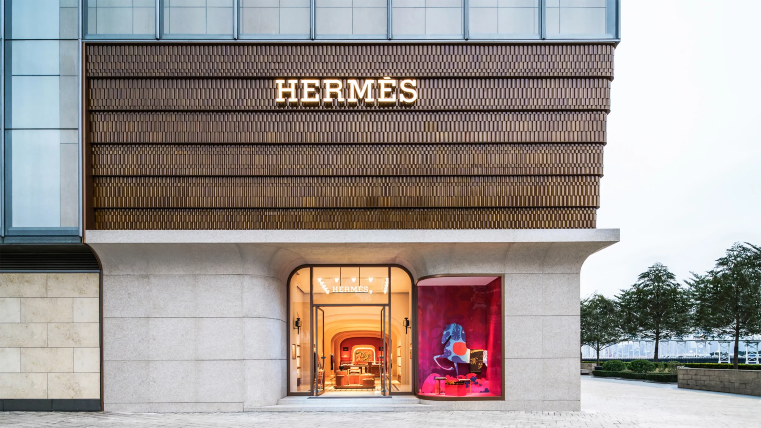
    Luxury fashion house Hermès has unveiled its newly revamped store at Hilton Plaza East, with a fresh design that pays homage to the surrounding culture and scenic beauty. Parisian architectural firm RDAI is credited with the store’s stunning redesign, which now extends over two storeys, each dedicated to an immersive display of Hermès’ 16 distinguished métiers.

    The updated store boasts an eclectic range of Hermès offerings, from their sought-after leather goods and chic fashion accessories to their signature perfumes and beauty products. Delicate jewellery, elegant watches, and a curated selection of home décor collections add to the store’s luxuriant appeal.

    Interplay of Culture and Nature in Design

    Incorporating a blend of geometric elements and dynamic materials, the store’s redesign has masterfully incorporated motifs inspired by Osaka’s local culture. These are complemented by a winged horse and floating clouds, symbolising Hermès’ annual theme, ‘Venture Beyond’.

    The store’s facade has been strikingly adorned with Mino-yaki ceramic tiles reflecting hues of green and blue, designed to imitate the shimmering reflections of water. This theme is carried into the store’s interiors which combine natural mineral surfaces in earthy tones with contrasting teal accents.

    Reimagined Storefront and Artwork Display

    The storefront windows bear the artistic touch of renowned French artist Matthieu Cosse. His art installations present an intriguing blend of celestial landscapes and theatrical elements, lending a dreamlike quality to the store’s exterior.

    The redesigned store also serves as a gallery for curated artworks from the Emile Hermès Collection and the Hermès Collection of Contemporary Photographs, seamlessly incorporated into the boutique’s inviting layout.

    This unveiling at Hilton Plaza East forms part of a broader renovation initiative by Hermès, with recently updated boutiques in Taipei and Hong Kong exemplifying the brand’s commitment to a refreshed and contemporary store experience.

    Questions & Answers

    What was the inspiration behind the redesign of the Hermès store at Hilton Plaza East?
    The store’s redesign was inspired by the local culture and natural landscapes of Osaka.

    Who was involved in the redesign process?
    Paris-based architecture studio RDAI was responsible for the store’s redesign, with French artist Matthieu Cosse reimagining the storefront windows.

    What can customers expect to find in the revamped store?
    The store offers a wide range of Hermès products, including leather goods, fashion accessories, perfumes, beauty products, jewellery, watches, and home collections. It also showcases curated artworks from the Emile Hermès Collection and the Hermès Collection of Contemporary Photographs.

  • Songmont’s Fusion of Old and New: Grand Reopening of Shanghai Flagship Store Reveals Exciting Redesign

    Songmont’s Fusion of Old and New: Grand Reopening of Shanghai Flagship Store Reveals Exciting Redesign

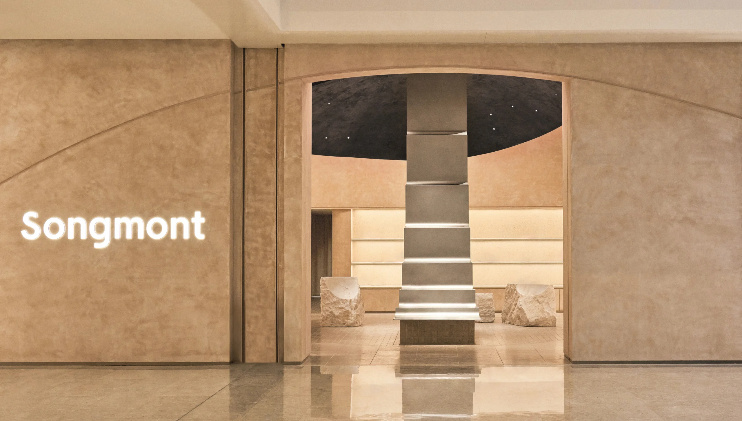
    Songmont, a premium designer brand based in China, has recently unveiled its revamped flagship store located in Shanghai. The store’s redesign showcases a unique blend of original and novel elements aimed at enhancing the layout and shopping experience for its customers.

    The Concept Behind the Revamp

    The original design concept for the store, known as ‘Windy Mountain Valley’, was a nod to the picturesque landscapes sculpted by wind and terrain. This concept is retained in the redesigned space, still encapsulating the harmony of nature and design.

    The updated store retains elements from its initial design while introducing new features that add more depth and definition to the space.

    Balancing Old and New

    Having been a part of the company’s journey for over five years, the flagship store in Shanghai holds significant importance for Songmont. The revamped store is not just about bringing in new elements but also about preserving the old, creating a unique blend of old and new.

    The updated store space now presents a harmonious blend of the familiar, a nod to the store’s past, and the introduction of fresh elements, signaling a warm welcome to new possibilities.

    About Songmont

    Songmont is a designer brand known for its premium leather bags and accessories that are not only functional but also carry a distinctive Eastern-inspired aesthetic. Among its assortment of products are the Luna Bag, Song Bag, Gather Bag, Drippy Tote, and Chocolate Bag. These are often characterized by their convertible designs, offering versatility to their users.

    Questions & Answers

    What is the concept behind the redesign of Songmont’s flagship store in Shanghai?
    The redesign retains the original design concept, ‘Windy Mountain Valley’, while introducing new elements to add more depth and definition to the store layout.

    What does the revamped store represent for Songmont?
    The updated store space presents a harmonious blend of the familiar, a nod to the store’s past, and the introduction of fresh elements, signaling a warm welcome to new possibilities and growth.

    What products does Songmont specialise in?
    Songmont specialises in premium, functional leather bags and accessories featuring Eastern-inspired aesthetics. Their product lineup includes the Luna Bag, Song Bag, Gather Bag, Drippy Tote, and Chocolate Bag, which often feature convertible designs.

  • WhatsApp’s Major Redesign: Status Updates to Take Centre Stage in Latest Android Beta

    WhatsApp’s Major Redesign: Status Updates to Take Centre Stage in Latest Android Beta

    As social media evolves, two prominent trends have emerged: the prevalence of private chats and the popularity of temporary “stories,” which allow users to share snippets of their lives without leaving a permanent digital footprint. This shift towards more intimate and transient forms of communication is evident in the recent changes that WhatsApp is implementing.

    WhatsApp’s Interface Revamp

    WhatsApp, a widely-used messaging platform, is piloting an updated design that prioritizes status updates, or “stories.” The latest beta version of the Android app showcases a new approach to these status updates. The most recent updates from a user’s contacts now appear at the top of the Chats tab, presented alongside the profile pictures of those who have posted them.

    The stories that populate the top of the Chats tab reflect the user’s most frequent interactions. In other words, the status updates of those contacts the user frequently communicates with and who have shared a status update will be prominently displayed. However, the traditional Updates tab, typically found at the bottom of the screen, remains intact. This suggests that WhatsApp may not be planning to discard it entirely, although as this is an early beta version of the feature, the final outcome could potentially differ.

    The new design maintains one key feature from its predecessor: the ability to mute status updates. If a user has muted updates from a specific contact in the Updates tab, these updates will not appear in the new top bar. As of now, this redesign has been seen only in the Android beta version, and it is not yet clear whether it will be rolled out to iOS platforms.

    Transitioning towards a Social Media Platform

    While WhatsApp initially positioned itself as a simple chat service, it is rapidly expanding its offerings and pushing into the realm of social media with this new feature. Regardless of the fact that there are currently no banner ads within the app, WhatsApp’s parent company, Meta, could potentially generate revenue by users swiping through these stories, paralleling strategies employed by its other applications.

    Questions & Answers

    What significant change is WhatsApp experimenting with?
    WhatsApp is testing a new interface that prioritizes status updates, or “stories,” from users’ most frequently interacted contacts at the top of the Chats tab.

    Will the traditional Updates tab be removed with the new design?
    At this stage, the Updates tab appears to be preserved in the new design. However, as this is an early beta version of the feature, the final version could potentially differ.

    Could this change allow WhatsApp’s parent company, Meta, to generate revenue?
    While WhatsApp currently does not host banner ads, Meta could potentially monetize users’ interactions with their friends’ stories, in a manner similar to its other applications.

  • Champion Unveils Culture-Infused Flagship Redesign in Chengdu: A Fusion of Sportswear Heritage and Local Crafting Traditions

    Champion Unveils Culture-Infused Flagship Redesign in Chengdu: A Fusion of Sportswear Heritage and Local Crafting Traditions

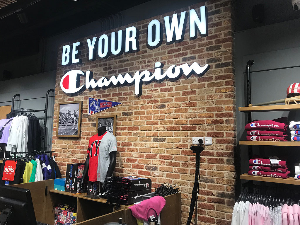
    Renowned sportswear brand, Champion, recently revealed the reimagined design of its flagship store located in Chengdu’s Yingjia Plaza, China. The refurbished two-story establishment beautifully integrates Champion’s established American roots with the traditional bamboo-weaving artistry inherent to Chengdu.

    Infusing Traditional Elements into Modern Retail

    The ground floor of the store is effused with textures inspired by bamboo, complementing the brand’s trademark collegiate and sporty themes. This strategic integration of bamboo textures illustrates Champion’s commitment to incorporating Chengdu’s cultural essence into its retail spaces.

    The upper level of the store incorporates an interactive model, highlighting a two-story sweatshirt exhibit and a DIY zone. The latter allows customers to partake in bamboo-weaving activities, such as making coasters, exemplifying the city’s rich artisanal history.

    Embracing Local Culture in a Global Brand

    Champion’s store redesign embodies the brand’s endeavour to adjust its retail spaces to reflect local culture whilst preserving its trademark Reverse Weave sweatshirt technique, a crucial component of the brand’s legacy. The Chengdu location serves as one of the first instances of this innovative approach.

    Established in 1919, Champion has been steadily revising its retail tactic in China to offer more interactive, culturally-embedded experiences. The Chengdu flagship is anticipated to serve as an archetype for future store revamps as the brand progressively aligns its global identity with local relevance.

    In the previous year, Champion was acquired by Authentic Brands Group from HanesBrands for a staggering US$1.2 billion, indicating the company’s persistent emphasis on broadening its influence in prime markets, including China.

    Questions & Answers

    What is the unique aspect of Champion’s renovated flagship store in Chengdu?
    The store’s redesign blends Champion’s American heritage with traditional elements of Chengdu, particularly bamboo-weaving.

    What interactive features does the store offer to customers?
    The store contains a DIY area where visitors can engage in bamboo-weaving activities, such as making coasters, reflecting Chengdu’s artisanal heritage.

    What strategy is Champion adopting for its retail spaces in China?
    Champion is focusing on providing more interactive experiences that are grounded in local culture, while maintaining its global identity.

  • Fitbit’s Exciting Redesign: An Exclusive Peek at the Modern Look and AI Coach for Premium Users

    Fitbit’s Exciting Redesign: An Exclusive Peek at the Modern Look and AI Coach for Premium Users

    The Fitbit application is undergoing a significant transformation, a move that has been anticipated by many. Some users are already experiencing the new updates, indicating that Google’s aim to give Fitbit a comprehensive Material 3 makeover is finally coming to fruition.

    Fitbit Receives a Visual Overhaul

    Last month, Google launched the Gemini-powered AI coach as a preview feature. Now, it has been reported that Fitbit Premium users in the US have gained access to the Material 3 Expressive redesign as part of a public preview. The new AI coach and the visual revamp are expected to be officially available to all users next year.

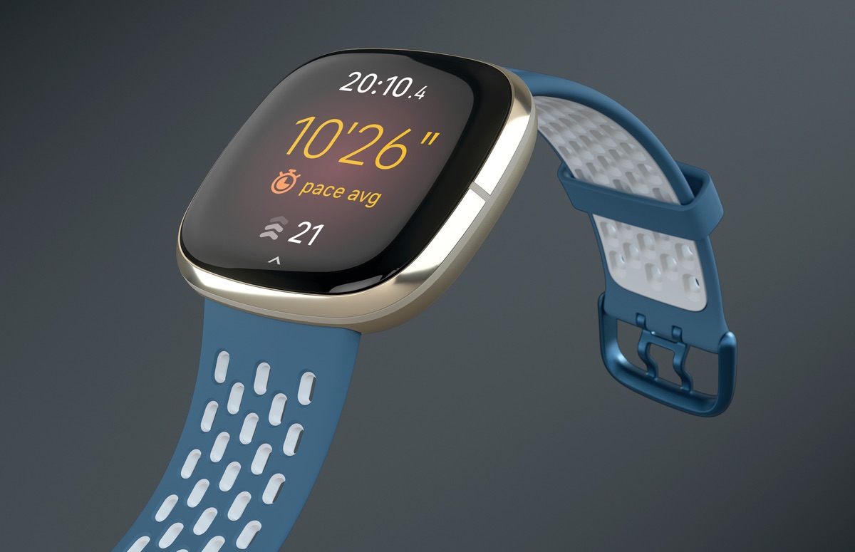
    The redesign incorporates Google’s Material 3 Expressive (M3E) style into the Android app, along with several navigation adjustments. The bottom bar has been made shorter, and synchronizing your Pixel Watch or Fitbit device is as simple as swiping down from any of the four tabs.

    When you do this, you’ll notice a circular loading animation cycling through the distinctive M3E shapes. Once the synchronization is complete, the “Fitbit Premium” label vanishes from the app bar and is replaced by a linear progress indicator.

    The new expressive shapes are also noticeable in various sections of the app, such as the checkmark animation that appears when you achieve a goal. Each metric view now features a floating toolbar with a floating action button (FAB) to switch between time frames. For statistics such as Steps and Sleep, you can switch between Day, Week, Month, 3 Months, or Year.

    Every pill-shaped bar includes a floating button that opens the personal health coach. The Today, Fitness, and Sleep sections now utilize a layered sheet-style design. The top statistics are displayed on a themed background, while the remaining content appears on a card layer that expands as you scroll. The distinct color themes – teal for fitness and purple for sleep – provide aesthetic separation.

    However, Dynamic Color is still absent. The bottom bar, toolbar, and FAB currently rely on Fitbit’s default blue accent.

    Google Delivers on its Promise

    Despite the redesign still being in preview stage, it’s encouraging to see Google fulfilling its promise to revamp Fitbit. The app plays a crucial role in the entire Fitbit experience. Whether using a tracker or smartwatch, it’s the hub for all health and fitness data. As such, giving it a design that aligns with other Google products is a positive development.

    From the preview screenshots, the layout appears a bit cluttered at the moment. However, this is an issue that can be easily resolved before the full release. For Fitbit Premium subscribers, it’s certainly worth exploring the update in its early stages. While it’s not perfect yet, it’s evident that Google is committed to making Fitbit more cohesive and modern.

    Questions & Answers

    What is the main aim of Fitbit’s redesign?
    The main goal is to modernize the Fitbit app, giving it a design that matches other Google products. This is part of Google’s effort to make Fitbit more cohesive and modern.

    What new features have been added as part of the redesign?
    The redesign incorporates Google’s Material 3 Expressive (M3E) style into the Fitbit app, along with several navigation adjustments. There’s a new AI coach, a shorter bottom bar, unique color themes for different sections, and new expressive shapes throughout the app.

    When can all Fitbit users expect to access these new features?
    The new AI coach and the visual revamp are currently in the preview stage but are expected to roll out officially to all users next year.

  • Google Unveils Enhanced Image Editor For Google Photos: A Closer Look At User-friendly Features

    Google Unveils Enhanced Image Editor For Google Photos: A Closer Look At User-friendly Features

    Google has just released a revamped image editor for its Google Photos application on Android. This newly designed feature, which users might find more user-friendly, can be accessed by selecting a photo from your Google Photos gallery and then hitting the Edit option located on the bottom bar of the screen.

    On the lowest part of the screen, a carousel featuring six options is now available: Auto, Actions, Markup, Filters, Lighting, and Color. Each of these options opens up a variety of editing tools that you can utilize to perfect your image.

    Further Editing Options

    Additional editing tools are available above the image preview. Here, you’ll find icons such as Auto frame, a dropdown menu with various aspect ratio choices, an icon to flip the photo, and another to rotate the image. The top left corner of the screen houses the exit button, labeled “X”, while on the right, there’s a Save button and a three-dot icon that opens a pop-up, which can be used to provide feedback to Google.

    Interactive Image Manipulation

    Once a photo is selected for editing, users can tap, brush, or draw a circle around any portion of the image they wish to edit. This action prompts a menu to appear, presenting all the relevant editing options you have at your disposal.

    For instance, after enclosing a squirrel in a photo with a circle, I was provided with options to Erase the squirrel, Move it to a different location within the photo, or use AI to Reimagine the image. After opting for the last choice and indicating my desire for the squirrel to be holding a baseball cap and wearing a hat, the software generated the requested image.

    Availability of the Feature

    This feature is currently being deployed on version 7.44 of the Google Photos app for Android, following a server-side update initiated by Google. If you haven’t received it yet, you can manually update by navigating to Settings > Apps > See all apps and scrolling to Photos. Tap on Photos, and when you see the App info page, press on Force stop.

    Questions & Answers

    What are the new editing options available on the Google Photos app?
    The redesigned Google Photos app offers a variety of editing tools including Auto, Actions, Markup, Filters, Lighting, and Color.

    How can users manipulate a specific part of an image?
    Users can tap, brush, or draw a circle around the part of the photo they wish to edit, prompting a menu with relevant editing options to appear.

    How can users access the redesigned image editor if it hasn’t automatically updated?
    Users can manually update by navigating to Settings > Apps > See all apps and scrolling to Photos. After tapping on Photos, they can press Force stop on the App info page.

  • Apple Music for Android update brings a slight redesign

    Apple Music for Android update brings a slight redesign

    Judging by the reviews left by Android users on Apple Music’s page in the Google Play Store, the app isn’t on par with the iOS version. However, it looks like Apple is making efforts to make the users experience as satisfying as possible.

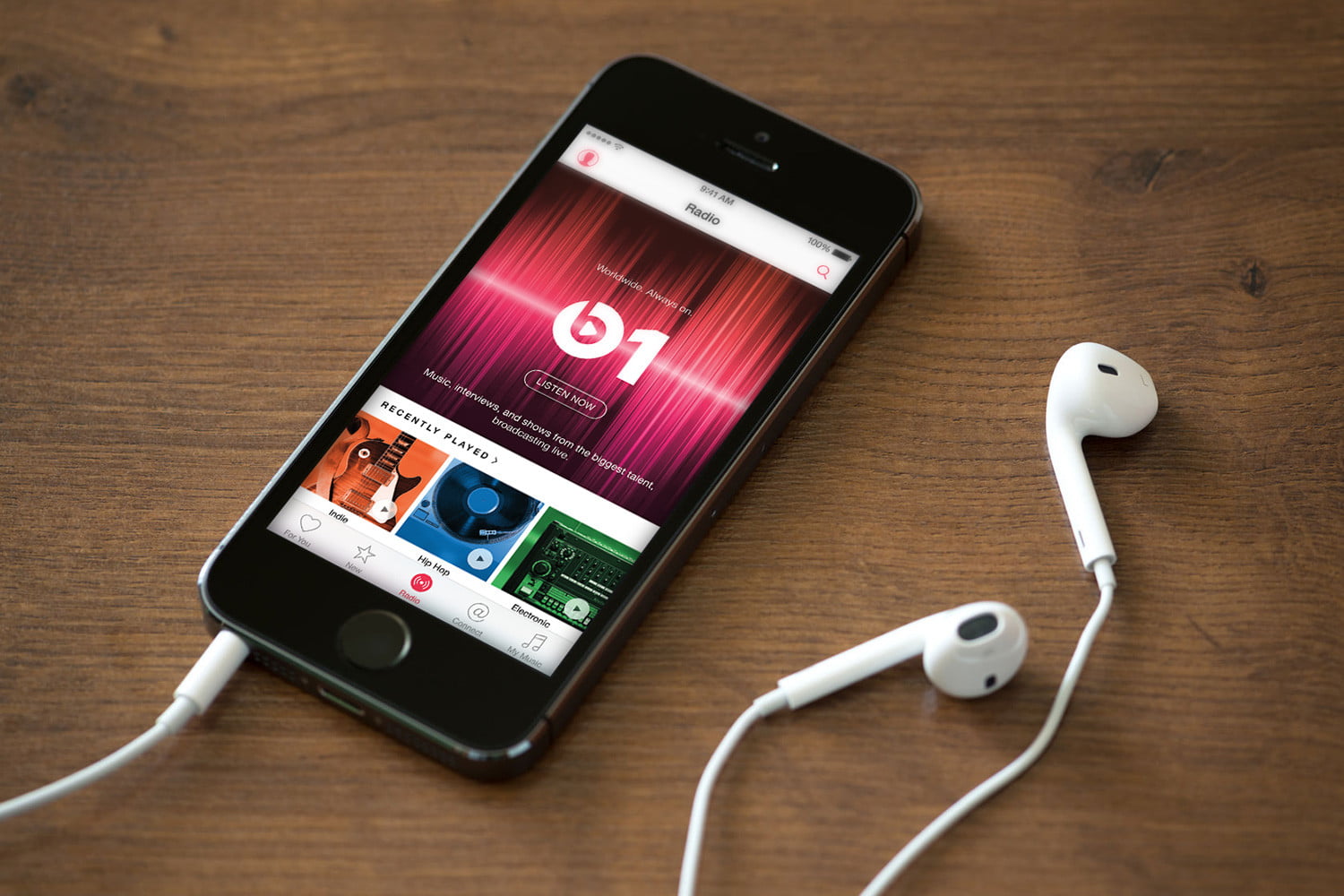
    The latest update released today brings a slight redesign of the Browse tab and support for more devices. The update adds a new Browse tab that was initially made available on the iOS version of Apple Music.

    The Browse tab contains more editorial highlights which are supposed to make it easier for Apple Music users to find playlists and new music they might like. With the new tab, starting to play music becomes a breeze as it removes a few clicks previously needed.

    The second major change included in the update is support for Chromebooks. If you own one, you’ll now be able to access Apple Music from Chrome OS. Last but not least, Apple mentions that it squashed some bugs as well, so expect fewer issues with the app after you download the update.