Tag: UI

  • Changes are coming to the Google Search UI

    Changes are coming to the Google Search UI

    The Google Search app user interface is about to get a new look. Google is testing some changes to the app, including a thicker search bar. Icons for voice search and Google Lens will remain on the bar. Also new, besides the girth of the search bar, is a carousel directly underneath with shortcut suggestions such as “Search recent Screenshots from your library,” get help for your homework using your camera and Google Lens, how to identify songs, and more.

    These suggestions can tell you about things that Google Search can do that perhaps you didn’t know about. They also can start the process and get the ball rolling with a single tap on the screen.

    Also new is a bell icon next to your profile picture in the upper right of the screen. Tap on it to see notifications related to all the topics you subscribe to on Google. Other improvements are coming to the app, including showing you search results even before you’ve finished typing. Just to let you know, this is different from showing you suggestions on what to search for as you type as that is currently available on the Google Search app.
    The difference is that with the new feature, Google Search will try to figure out what you are looking for even before you finish typing it into the search bar and will show you results before you are done. If Google has the correct topic, you will shave valuable seconds off of your session with Google Search. If Google is wrong, the time it takes you to look down on the screen to check and type your query out completely will add a few seconds to your Google Search session. So for this to be useful, Google has to nail the algorithm.

    Right now it’s still being determined whether Google is disseminating the changes mentioned above to the Search UI to everyone or if it is part of an A/B test (Google is known to run these often).

  • Spotify is now testing a new Car Mode UI for safer music listening while driving

    Spotify is now testing a new Car Mode UI for safer music listening while driving

    Driving is always more fun when you’re enjoying your favorite music, or listening to a podcast while you’re stuck in a traffic jam. Now, iMore reports about a new Car Mode look that Spotify is working on, designed especially to make it easier and safer for drivers. Check it out.

    The new Car Mode is a feature that will make it safer to use when you’re driving. This new feature comes after Spotify abandoned Car View, which actually was doing something similar.

    For now, the feature is not official, but the new look has been showcased on Android, and you can see what it will look like once it gets officially released. Most likely the feature will also have its testing period on iOS devices as well, and some might have gotten to test it already.

    What it is is bringing larger buttons that are easier to tap on while you’re busy looking at the road, and as a whole, the interface of the popular music-streaming app is simpler. However, it does have more options than what Car View had, as Car View was quite simplistic.

    Killing Car View was actually in order to have Spotify users look into the Car Thing accessory that the company released recently.

    Spotify is now prompting some users to “test drive” the new feature when they connect their phones to their car. One of the best features Car Mode brings is that you can easily browse and search for different music to play in your car, something that the old version, Car View, didn’t have.

    You get to have a home screen, a library view, and a voice control button so you can just give it commands and have your hands on the steering wheel. Of course, you get also simple media controls like play/pause, and others.

    The Library tab gives you a glance at the music you’ve listened to most recently. This feature is still in testing for Android (and probably soon for iOS users), and no official release date has been announced as of yet.

  • Tesla Updates Mobile App With New User Interface & Features

    Tesla Updates Mobile App With New User Interface & Features

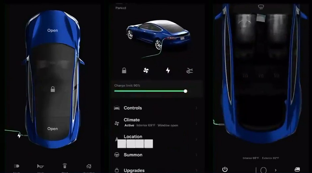
    Tesla has released version 4 of its mobile app which receives a massive overhaul of the user interface and adds a ton of new features. Users can unlock their vehicles using the app and remotely also manage the climate control system of the car apart from many other connected car functions. Version 4 is clearly the most comprehensive update to the app.

    Via the app users can also access the after-sales experience and book the car for servicing and repairs. It also lets users know the charge levels of the car remotely which is quite critical.

    Here are the new features that Tesla lists in its official release notes:

    — Refreshed vehicle and energy homepage
    — Streamlined Summon experience
    — Enhanced phone key support – vehicle no longer needs to be selected
    — Send commands to vehicle immediately upon opening app
    — Use Go Off-Grid to seamlessly disconnect your home from the Grid with Powerwall
    — Shop the Tesla catalog and view and manage your orders (available in select countries)
    — View Supercharging history and ability to pay outstanding Supercharging or service balance (available in select countries)

    Tesla is one of the first automotive companies to push over the air updates and has its own app.

    Tesla has also added support for widgets on iOS which was introduced in iOS 14 last year. Tesla has also added the supercharger billing experience in the app which comes at a time when the manufacturer is opening up the network to third-party vehicles.

    This update comes at a time when Elon Musk has said that it is close to rolling out its full self-driving software to users who opted for the package. Musk estimates after the release of the next beta, in 4 weeks the software update should be rolled out to users.

  • Android users should now have a better performing Snapchat

    Android users should now have a better performing Snapchat

    Snapchat disseminated a tweet today announcing that it has released its new Android app. The app was rebuilt from the ground up so that it could be faster for Android users. In rebuilding its Android app, Snapchat had to take into consideration the many different cameras and chipsets used on various Android handsets. The decision made to revamp Snapchat’s Android app came in 2017 when it became clear that the messaging app’s iOS version was superior.

    In early 2018, Snapchat staff realized that the Android app was always trying to run code in the background, leading it to act laggy. Thus, the decision was made to rebuild the Android app from scratch. The challenge facing Snap’s director of engineering, Gustavo Moura, was how to make the messaging app run the same on flagship Android devices and lower-end models alike. Eventually, the Snapchat development team was able to get it done and the app’s Android subscribers should see Snapchat run faster once the new version is installed. In addition, better performance should be seen on lower-end phones. To make sure that updates are running bug-free now and in the future, Snapchat is testing them on a larger number of Android-powered devices.

    “Android devices don’t all behave the exact same way, right? It’s very easy for us to build an Android app that will work well on flagship devices like the Pixel 3. It’s more challenging when you have to capture the whole ecosystem, especially when the camera works very differently from manufacturer to manufacturer.”- Gustavo Moura, Director of Engineering, Snapchat.

    Those installing the updated Snapchat app on their Android device won’t notice any changes to the UI. Instead, Snapchat concentrated on improving things under the hood so that the Android app could run as fast as its iOS app. And while the new version of Snapchat for Android has begun rolling out to some now, it won’t be fully available until the end of this year.

    Originally known for its self-destructing messages that would automatically delete after ten seconds, Snapchat developed the Stories feature in 2013. Users can post a series of images that remain on Snapchat for 24 hours to help them convey a story. In addition, the popular Snapchat Lenses feature uses AR to help add cartoonish features to a member’s selfie.

  • Polycom extends use of Skype for Business UI

    Polycom extends use of Skype for Business UI

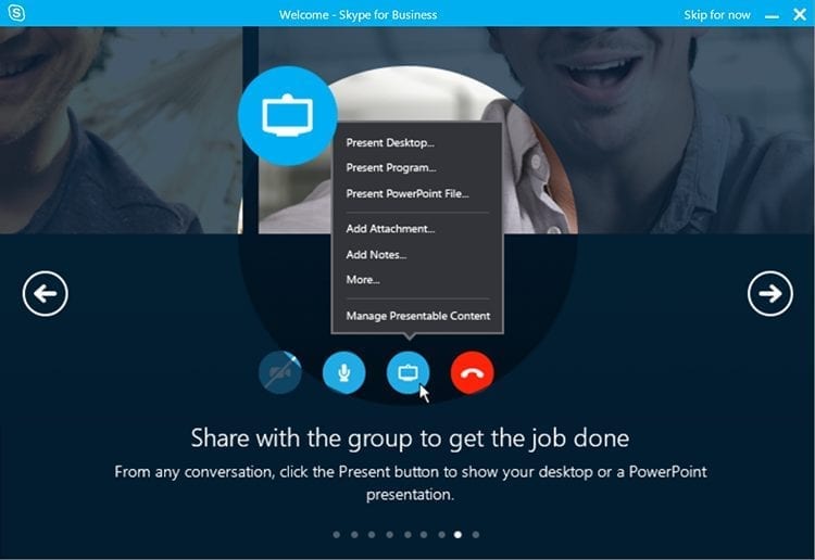
    Polycom has announced that the Polycom Group Series video endpoints and several of its voice solutions will include the Skype for Business UI.

    Many organizations are wanting to move to one interface for collaboration tools to make it easy for users to join calls from any endpoint or software application. Consistency of scheduling, joining and managing a collaboration session is critical to driving user adoption.

    In response to this demand, Polycom extending the Skype for Business experience beyond the desktop and mobile applications to voice and video solutions used in conference rooms and offices of all sizes.

    Customers can now schedule, dial and join a Skype for Business call from a greater number of endpoints, providing one extended Skype for Business experience.

    “Many organizations across the globe are moving toward consolidating their UC environments into a single interface to drive a consistent user experience and ease of use,” says Irwin Lazar, Vice President and Service Director, Nemertes Research.

    “The desire to enable a consistent method of scheduling collaboration sessions and a single-click to join meetings from any application and any location is a top priority.”

    In addition, Polycom has officially become a Skype Operations Framework partner and will assist customers with all facets of the Skype for Business lifecycle, including planning, deployment, adoption, and operations.

  • Comptel unveils intelligent UIs for digital services LCM

    Comptel unveils intelligent UIs for digital services LCM

    Comptel has added a set of operational user interfaces (UIs) to its FlowOne V solution, tailored for specific user groups within service providers.

    The UIs are designed to increase productivity, empower the critical service orchestration processes behind frictionless delivery of end-to-end virtualized services, and accelerate time-to-market.

    FlowOne V incorporates virtualized network function (VNF) onboarding and service chaining, digital service design and orchestration, and dynamic, closed-loop service assurance.

    By providing a holistic, end-to-end view and orchestration of digital services, it allows operators to transform their current service delivery processes by connecting the cloud and physical resources (compute, storage, network) with business management processes and systems (customer care, billing, customer order management).

    With the addition of four new intuitive UIs called “Hubs,” FlowOne V translates the service orchestration process into routine tasks, specific to individual user groups.

    The UIs strengthen the solution with inbuilt intelligence, including the normalization of service terminology between multiple platforms to make them easily manageable and reusable components, and the validation of service specifications to avoid unnecessary mistakes.

    “Intuitive operational UIs are a key factor for increasing the speed at which services can be developed, verified, deployed and improved – consequently reducing time-to-profit and increasing customer satisfaction,” said Antti Koskela, EVP of Comptel.

    “By adding this new functionality to FlowOne V, we’ve created a new paradigm for operationally managing NFV and SDN, empowering service providers to more effectively specify, test and deliver services across virtual, physical and IT domains,” said Koskella.

    The four new UIs include DesignHub, OrderHub, LifecycleHub, and SystemHub.